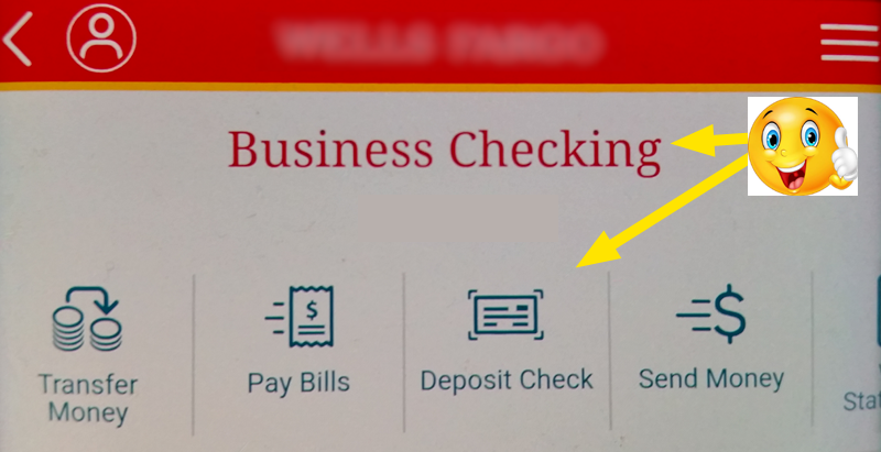
Hey, wow, this mobile app is so nice, big buttons, clearly labeled. What a great start into building my trust in their attention to detail, quality, and security!
Let me try this thing out…. tap, tap, tap… done! Wow, that was so easy, this unnamed corporate entity sure made me a happy camper…
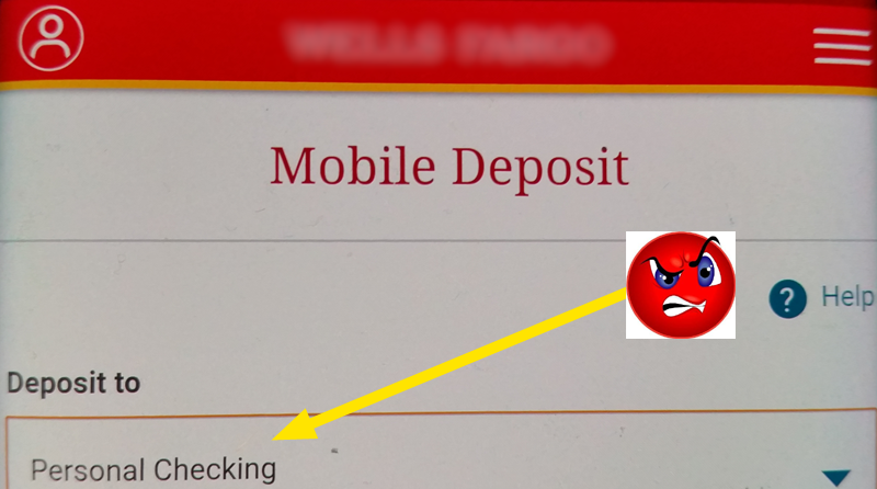
*ring, ring* : “Hello?” … “Ummm… what do you mean it didn’t get deposited?” … “No sir, I logged in to the business account and deposited it…” … “I’ll call the bank right away.”
*ring, ring* : (10 minutes later after navigating ridiculous robo menus and hold times) “Hello, unnamed corporate entity? I seem to have mistakenly deposited a check to my personal account that was meant for my business account, can you fix it?” … “You can’t? I just did it a few minutes ago, it shows as pending, what do you mean you can’t fix it?” … “I realize it’s all my fault, I thought I was in the business account…” … “…Yes, I realize now that there’s a different box for the deposit to account…” … “No! I clicked deposit check from my business account…” … “Well I understand now that’s not how it works, but I just need you to fix the transaction or cancel it or something!” … “You can’t? How is that possible? What’s the point of a transaction pending if it can’t be corrected while it’s pending? What’s going to happen now?” … “Really? Your system will automatically figure this out in 7-10 business days?” … “You have a nice day too, but your company sucks!”
Contextual navigation, dynamic presentation, GOOD UI/UX is not just a luxury anymore, it’s an expectation & demand.

Despite what Tier 1 Customer Service may deduce from their grouchy colleagues & underpaid perspective, any connection we create within our UX, whether intentional, or unintentional is our responsibility. In the above example, the unnamed corporate entity created a very clear contextual link between the account and the navigation below it, therefore EVERY SINGLE ONE of those buttons will be reasonably expected to be related to the “business account” context. Lazy UX throws a drop down list in the next screen & leaves it to the user to adjust their perspective to the screen. In the 21st century, this is a grave sin! Dynamic & responsive UX is the expectation & the savvy will not waste their energy trying to adapt to a lazy UX.
There are plenty of grouchy mobile application developers out there too, & let’s be honest, the above example will work for 9 out of 10 deposits, maybe more, but sooner or later it will become a trap for the user. At some point they will forget the redundant click on the account drop-down (like I did) and create a problem. Their mind on 5 things at once & poof, they’re betrayed by the poor design.
“If builders built houses the way programmers built programs, the first woodpecker to come along would destroy civilization.” – Gerald Weinberg
Good UX design would never risk the contextual connection implied in the above workflow. Bad UX design will create support headaches that never end, and ridicule of a client’s failure to jump through all of the hoops is the cause of the problem, not the solution. A good UI/UX team will accommodate every reasonable expectation. When we reach the 22nd century, perhaps our UI/UX will even be reading users’ minds. Until then, we can at least meet the 21st century fully equipped, and leave the 20th century to the woodpeckers.